Arena Entrances
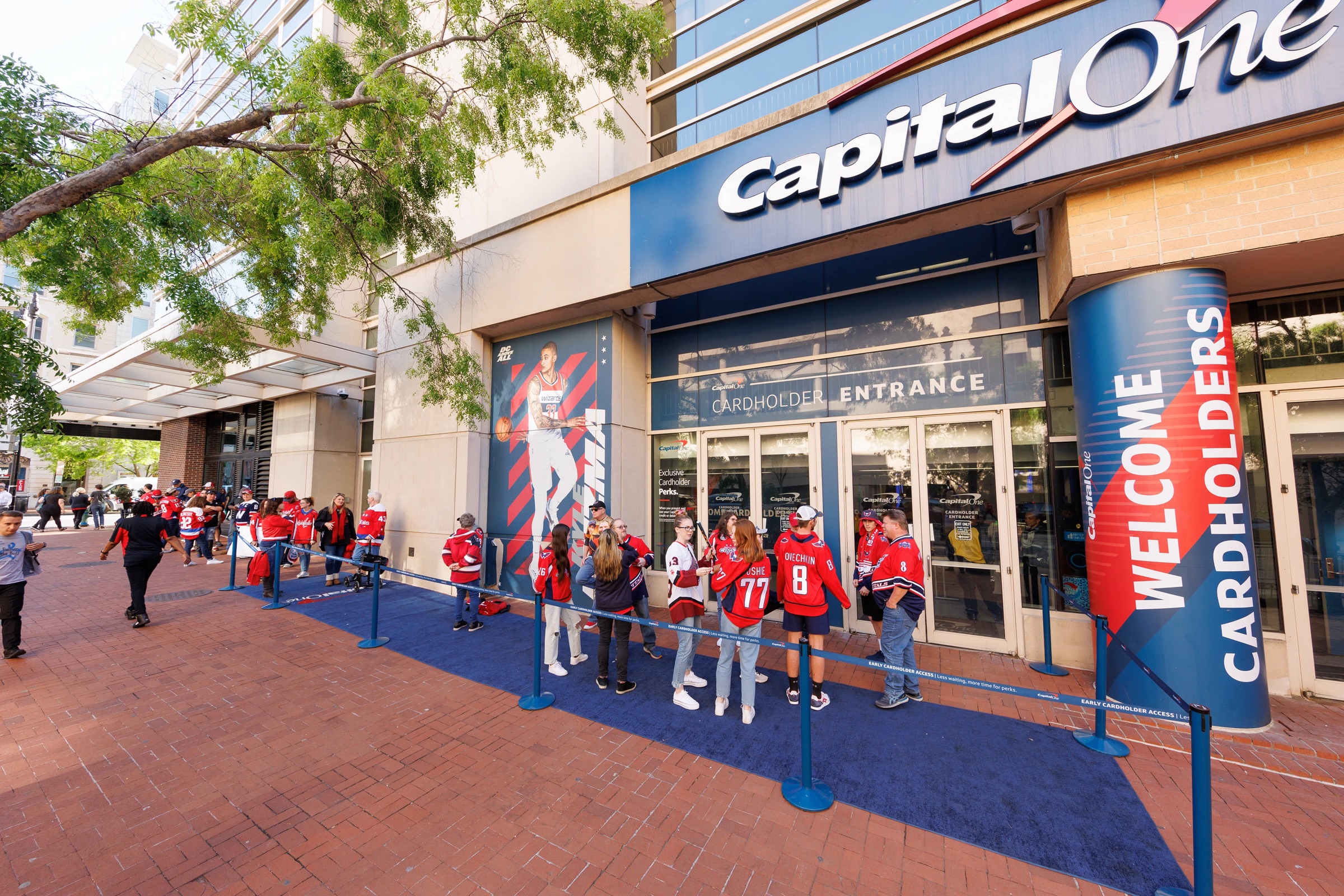
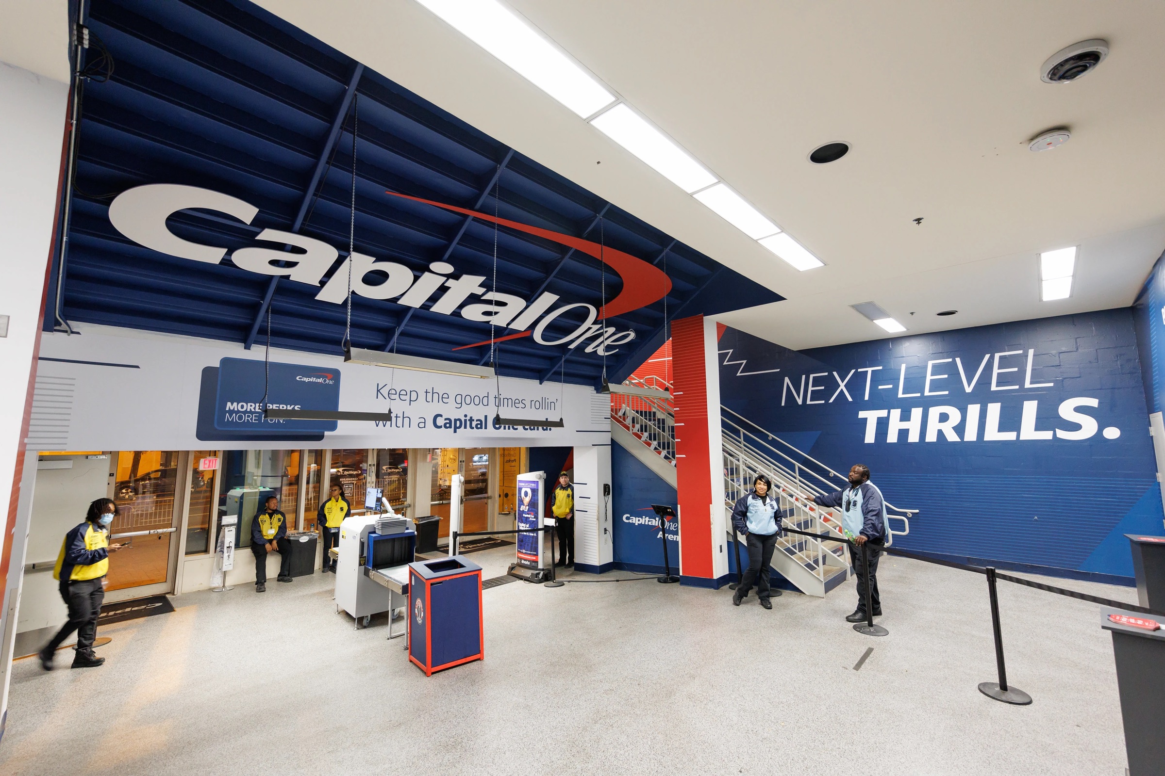
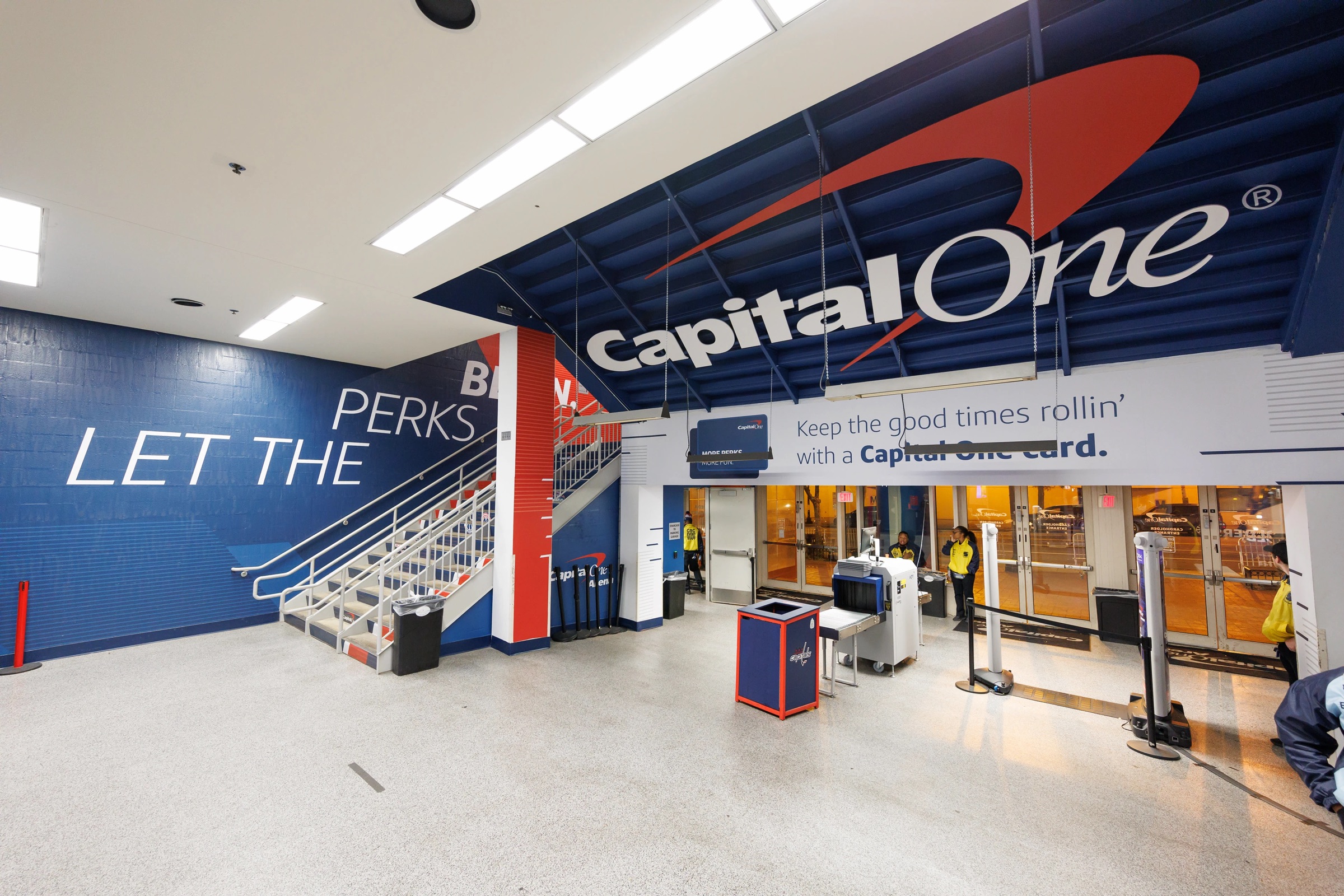
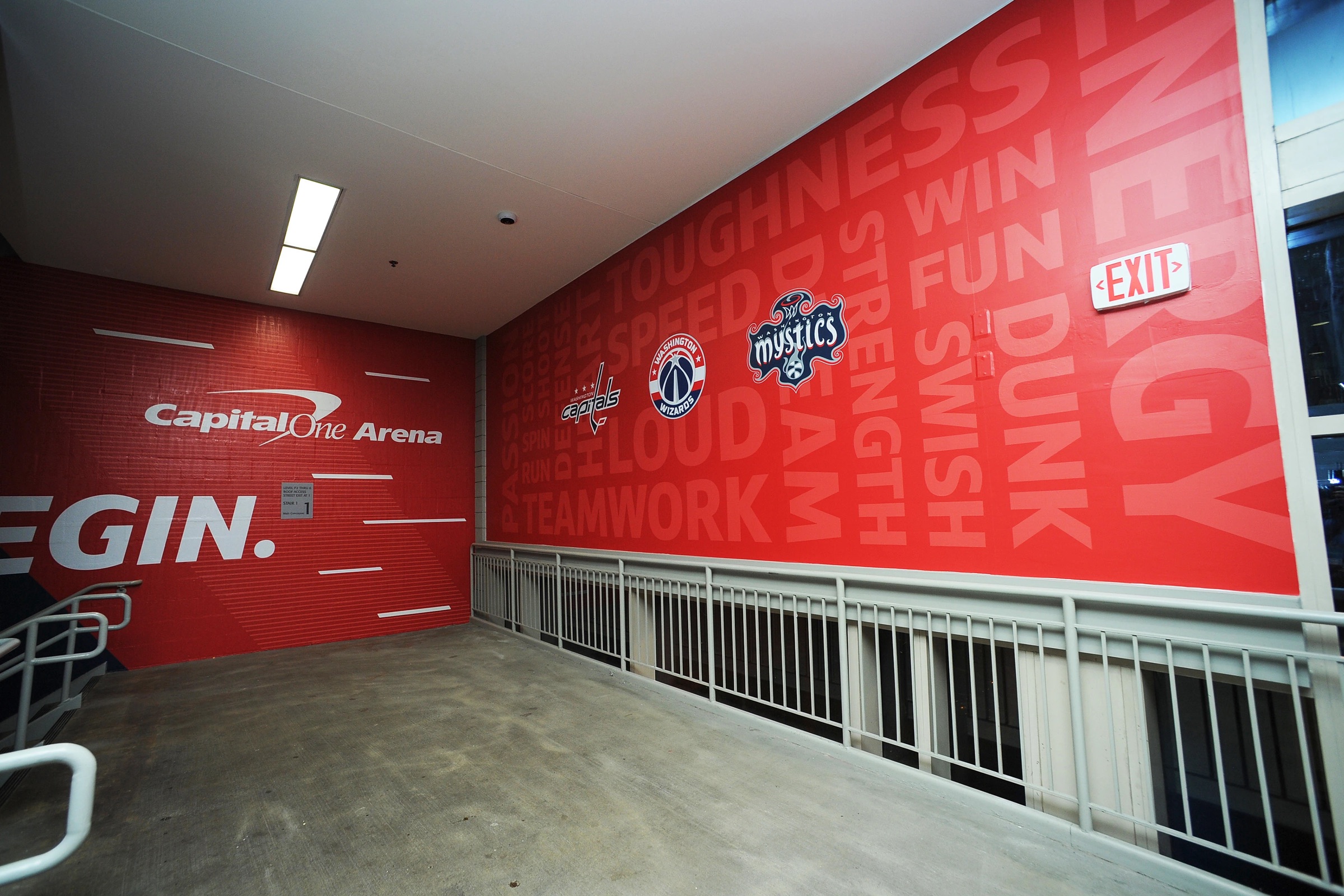
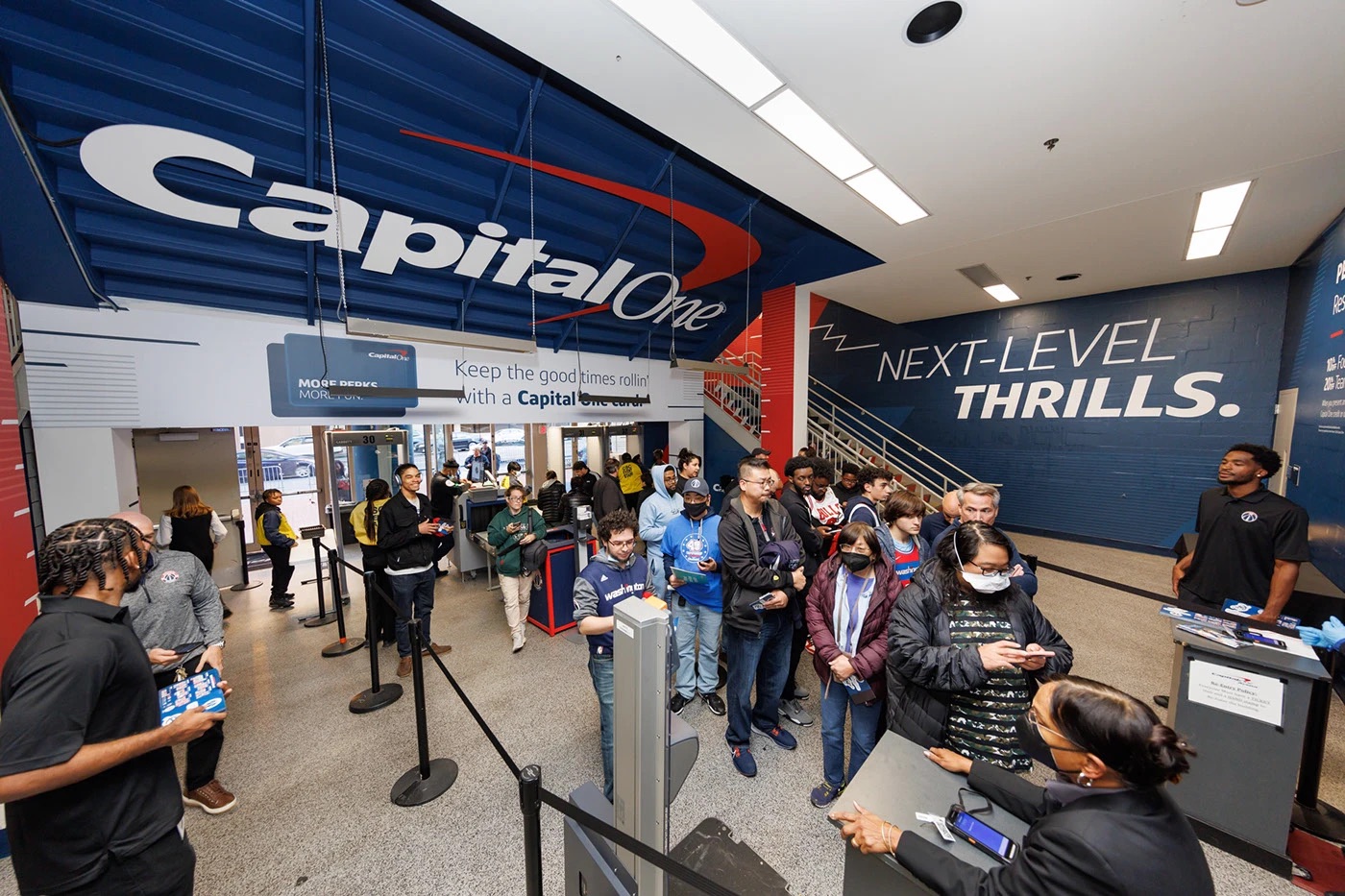
Every fan gets the welcome. Cardholders get the blue carpet.
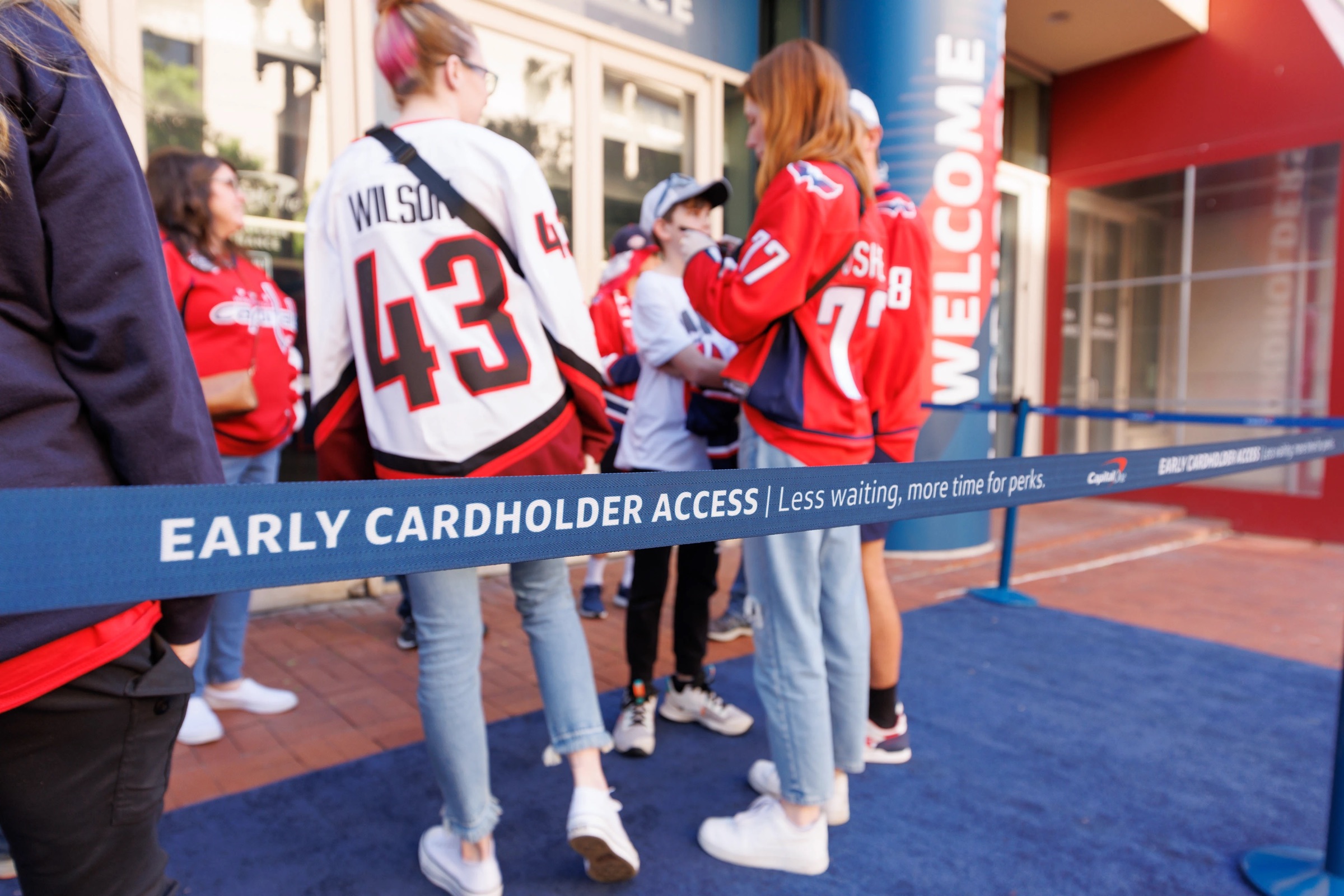
The Cardholder Entrance
Problem
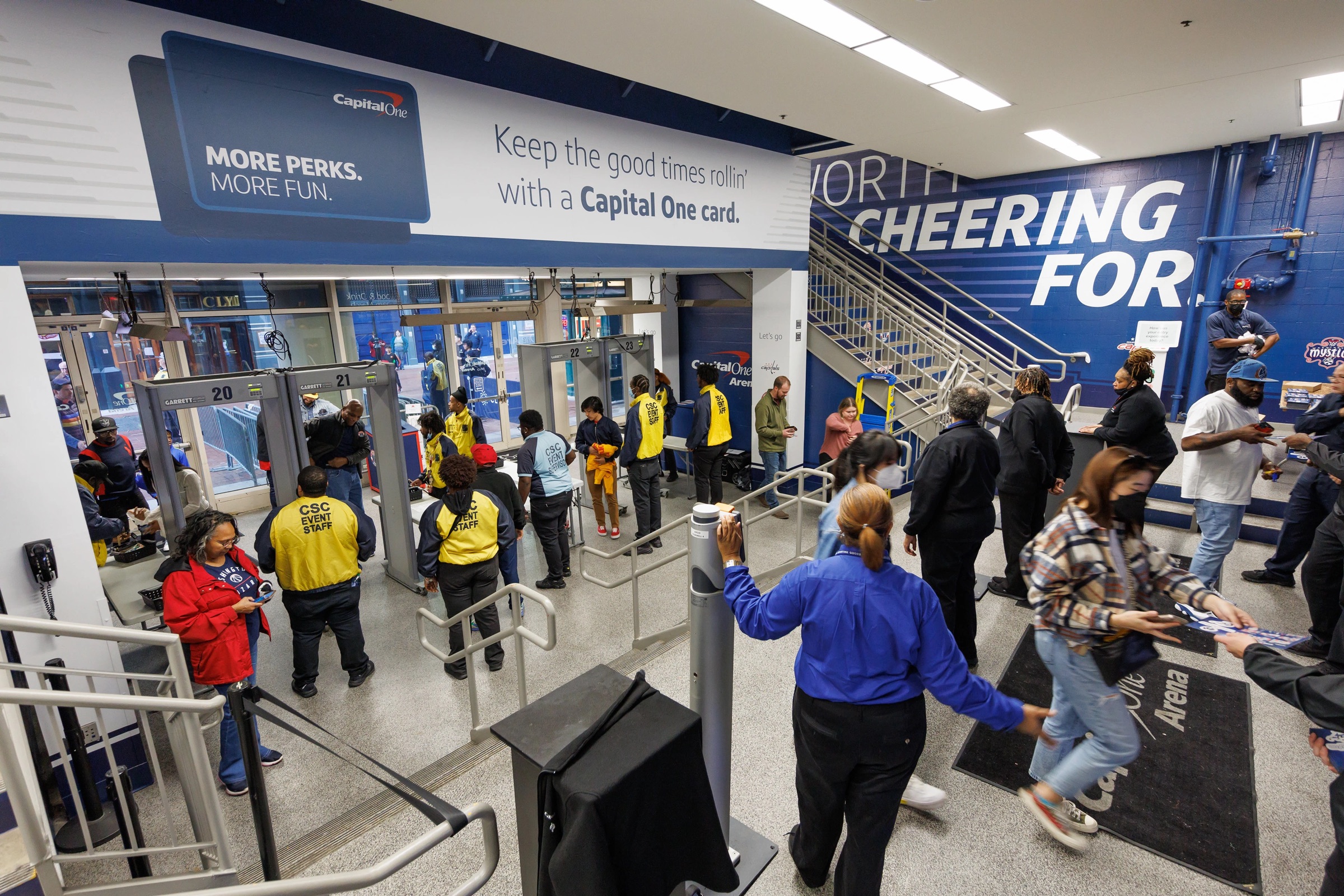
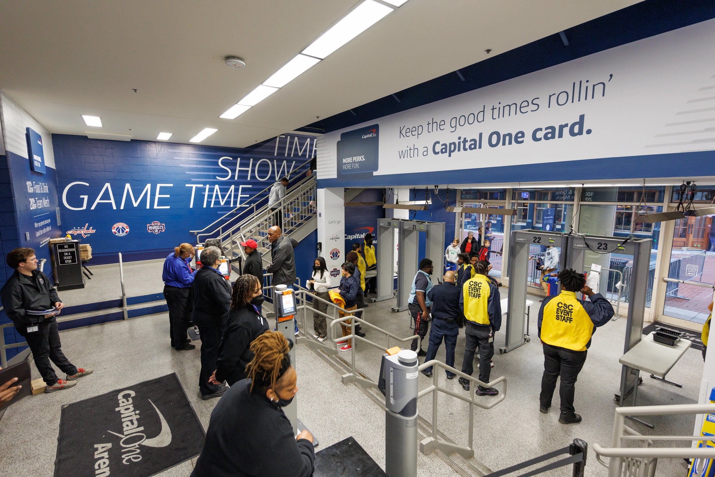
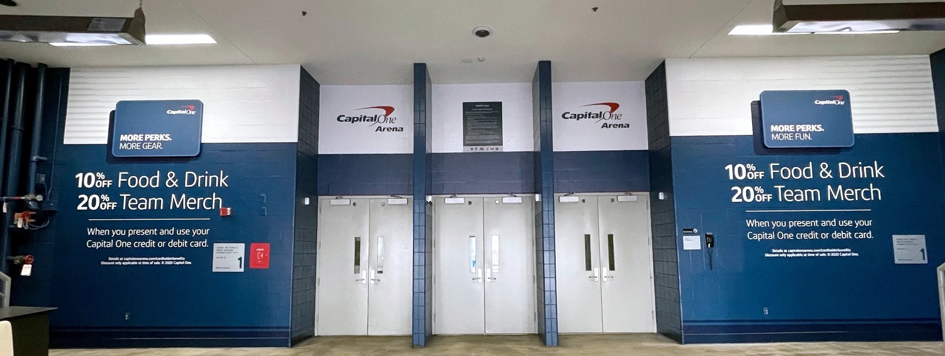
The general admission and Capital One Cardholder entrances looked and felt the same. Fans walked through either one without realizing the Cardholder line was shorter, and that showing a Capital One card was the only reason.
Solution
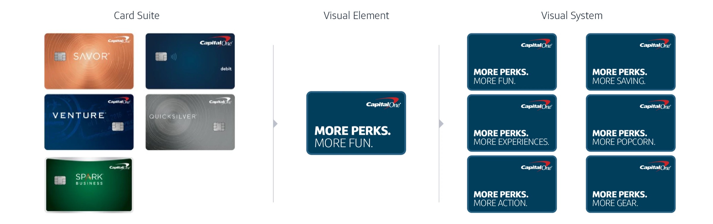
Customer research, journey maps, and on-site walkthroughs informed two distinct entrance experiences: one for every fan, one built around the energy of being a Capital One customer. A shared design system kept a consistent brand identifier across both without the clutter of stacking every card color side by side. The Cardholder entrance, card required, got its own blue carpet, built to generate the exclusivity, FOMO, and word-of-mouth that keeps VICs (Very Important Cardholders) talking all night.
Credits
- Creative Strategy & Direction
- Chris Irwin
- Art Direction
- Joanna Sugar
- Copywriting
- Stephanie Anderson & Atain Ibia
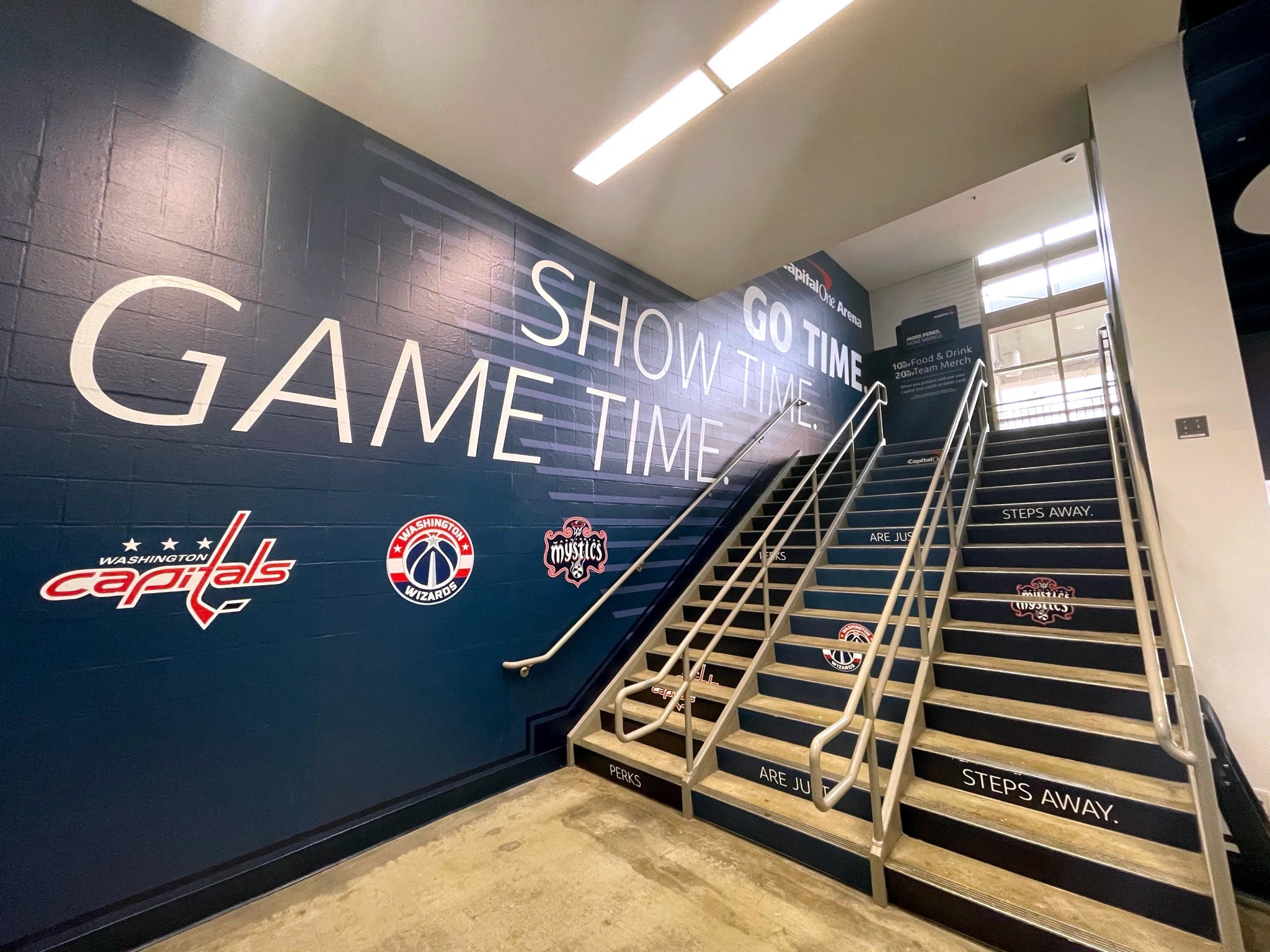
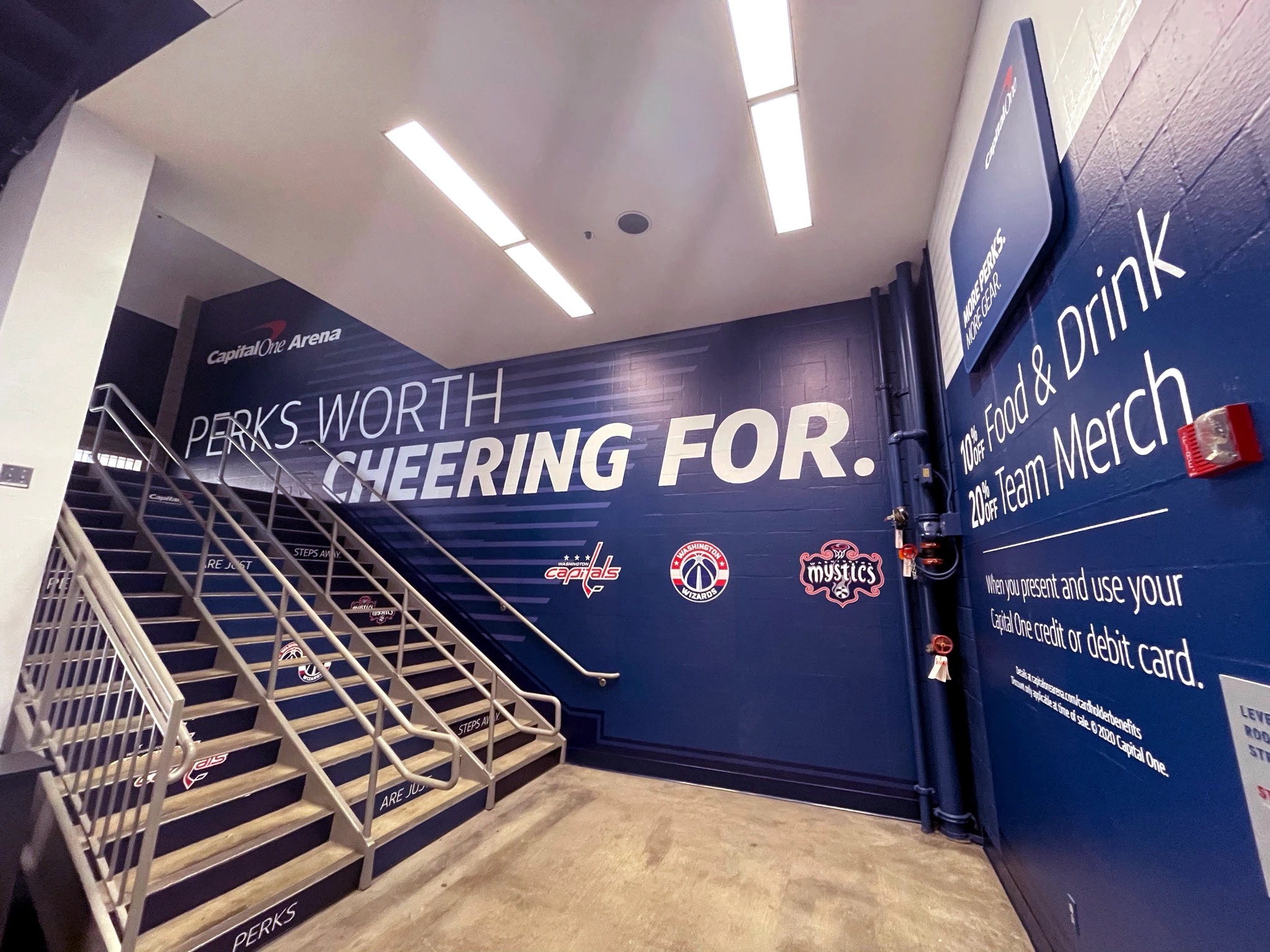
The F-Street Animation
Problem
When the Verizon Center became Capital One Arena in 2017, the F-Street entrance got new walls, lighting, and signage, but the fan experience walking through it hadn't been rethought.
Solution
Meet fans at the door and match their energy, without hitting them with product messaging before they've even found their seats. Timed and observed fans walking in to understand the entrance journey before a single frame was produced, then built the content around it: a welcome animation, Cardholder benefits, and a reminder, delivered right as fans walked past, of how close their own entrance actually was.
Credits
- Creative Strategy & Direction
- Chris Irwin
- Art Direction & Animation
- Tilt